Monday, July 19, 2010

Whimsy Blog Hop! New Stamps! Candy!


If you have come from Rowena's Blog, you have come to the right place!  If you have landed here randomly, you might want to start the blog hop at the beginning here at Chris's Blog.
Whimsy has some new red rubber released and available for purchase today and this is one of the new stamps!  Introducing,"Moonlit Ride".  I think it is one of my personal favourites that I have drawn, although I usually say that with every new one I do, lol!  I wanted this carousel horse to have a dreamy, starry look to it,  so I coloured it with dramatic colours!  (colours listed below)
There's lots of other new rubber released today too - beautifully designed sentiments by Raindrop Echo Designs Designs, and a couple more I have drawn, including a couple of cute little girls, so be sure to check them out.  And, Ann is having a sale this month on her digital sets - 
25% off!  (on her digital sets only, not red rubber) from July 17 thru July 31!!

You have until Monday July 26 to hop around to all the DT members blogs.  At that time, a winner will be drawn for the blog candy pictured here!  It is all six new release stamp sets!!


As you can see in the piccy, Whimsy is releasing my little elephant image that I had previously only offered as a digital image through Squigglefly.  Now you can get her at Whimsy in rubber!  I have dubbed her, "Jelly Bean".  
Next stop on the hop is Denise!  She is the proud owner of Whimsy Stamps, and such a delight to work with.  Hi Denise, waving!!

Card details:
I made the dark blue background paper by doing a watercolour technique using salt.  There's a great tutorial for this technique on Splitcoast Stampers right HERE.  The only difference is I used water colour paint - but you can use ink like it states in the tutorial, and it will work just as well.

And here is the colour list for the image:

The blues:
B32, 34, 37, 39
The moon and stars:
Y00, 15, 18, 19 (tiny bit of E99 on moon and on bridle star only)
The reds:
R12, 14, 17, 29
The greens:
G21, 24, 28

I am entering this card into the following challenge:
Stamp, Scrap and Doodle Saturdays: Animals
Colourless blender used throughout the horse's body to soften the area around the stars and moon. Here is your close-up:

Thanks for visiting my blog today, Precious Peeps!   God loves you and wants you to know His love, His joy and His peace!  May He bless you today with a deeper knowledge of His amazing love for you!

Sunday, July 18, 2010

Sundays With Crissy #7 - Christmas in July!


Hi Peeps!  Here's one of the Christmas/Winter images I just released as a digital image with Whimsy Stamps. I've called it "Warm Winter Wishes" and it is available now for purchase and immediate download!
Coloured with the following Copics:
Polar Bear Fur
E50, BV20, 23, B000 with R20 in his ear and E13, 19 on his nose.
Scarfs, hat and other red things:
R20, 22, 24, 27, 29, 59
Penguin Black:
C0, 1, 2, 3, 4, 6, 8
Beaks and Feet:
E93, 95, 97, 99
Turquoise Hat:
BG45, 49, 10
Striped Hat:
BG10, 11, 72, 75, 78, R24, 29
Back Ground
BG0000, 000, 01 (afterwards I sponged the edges with a greenish blue ink while it was still in the Spellbinders die - can't remember which ink)
Shadow under characters:
BG72, 10, BV20, 23
Cheek blush
0 and R20

I made it for my Sundays With Crissy challenge #7 this week, which is "Christmas In July".  I feel it is never too early to do up some Christmas cards.  Besides, it is my favourite card occasion of the year!  Why not join in and get a jump start on Christmas cards!?  Come on over and see what the rest of the Crew have designed to wow you with.  :-)  I have a new Guest Designer joining in this time too! Why not head on over to the Sundays With Crissy blog and find out who it is! 

I uploaded a static tutorial yesterday on how I use Copics to do the folds of clothes and also hair.  Scroll down to the next post if you wish to see that.
Bless you and thank you for coming by for a visit today!

Saturday, July 17, 2010

Copic Tutorial for Clothes and Hair


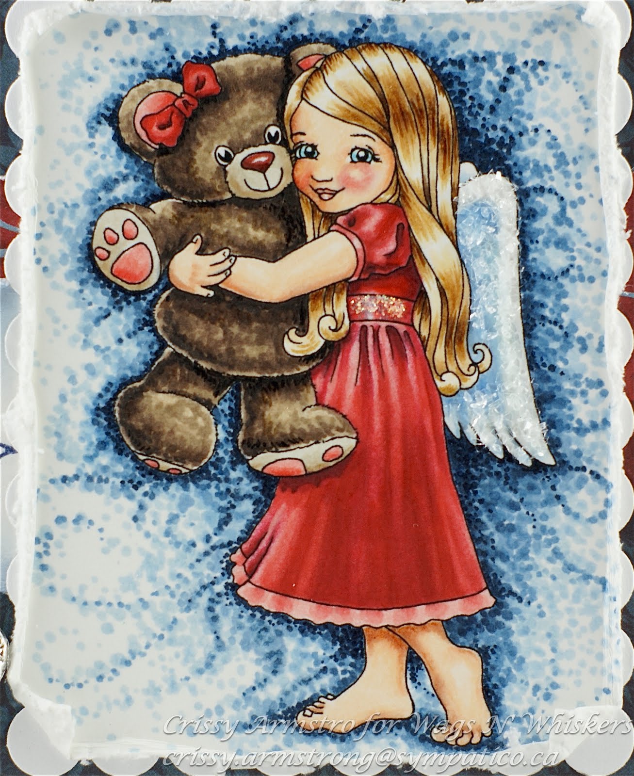
Hi Peeps!  I have two little tutorials to share with you today, on how I colour the folds of clothes and the shine and texture of hair using Copic markers.   I took still photos while I was colouring my Wags n Whiskers image called Bear Hug.   I hope I have given detailed explanations with each photo so that what I did will be clear to you.  If you still have questions, drop me a note and I'll try to clarify for  you.

Folds of a Dress:
I started by making a decision first of all where the light source would be and where the lightest highlights would be and the darkest shadows.  In this instance, I mentally placed the light source above her and slightly to the right.  This meant that the brightest points on her dress would lie on top of the folds that stick upward and outward towards the right.  The darkest shadows would be within the folds in between the highlighted areas (speaking of the area under her waist band) and within the little fold lines of her sleeve.  Also under teddy's foot and under the edge of his body where it rests against hers.
I started with the lightest red, R20 and with a very light stroke, lay down these strokes of colour.  I did not put R20 where I knew I wanted a very bright highlight.  By leaving the paper white where I want the brightest highlights to go, I don't loose them later to over-colouring... you'll see what I mean as we go on.

Now I have taken R22 and added a few strokes of this slightly darker shade beside most of my other strokes, with the exception of some of the narrow folds just under her waistband.  This just gives R20 a more gradual blend as we move towards darker reds.  I did not blend them together yet, just laid them down beside each other.

Here is where I added R24.  Again, no blending yet.  Just blocking in the colour.  Blending will come later!  I still left some parts not coloured.  In this case, I left the highlights but also I did not put colour where I want the deepest darkest shadows.  Reason for that is, the darker Copic colours tend to have a lot more pigment in them.  This thicker pigment cannot be layered as successfully.  Too many layers of dark colours will cause the ink to settle on the surface of the paper, and that does not usually look good.  It tends to look gloppy and shiny.  Is gloppy a word?  
So you can see where I left some areas un-coloured: at the bottom of her sleeve and under her sleeve,  under the teddy's foot, and the deep parts of the folds under the sash.

I made a bit of a colour jump here, all the way to R29.  I could have used R27, but I wanted her dress to have the appearance of a very deep red.  So R29 went into all the places I had left for the darkest shadows, and over a major portion of it on the front. I pulled some strokes up into the folds where I had left some white spaces.  Again, I was not concerned with blending at this point.

Here I added R59 under the arm and along her back, under the lock of hair that falls under her arm and beside teddy, in the narrow folds up near her sash, but very little there, and a teeny tiny bit along the folds at the bottom front of her dress.

Now I was ready to do some blending.  I took R20 and began to blend starting in the places I had left white on her dress. Because I left the highlights white, they remained very vibrant and light with only a thin layer of R20 over top.

I realized after blending with R20 and seeing how it didn't blend out enough that I would need to add R27 to smooth the transition between R24 and R29.  And so I added some R27 here:

I went back to R20 to continue to soften the blends all over, being careful to avoid the very light highlighted areas and the very dark shadows.  Also, I fixed some of the bleeds that happened using the blender pen.  Red is the hardest colour to remove with the blender.  But it can be done, up to a point.  The trick is to push the colour back towards the line a few times, then wait about five minutes for the paper to dry.  Then repeat the process:


After I was satisfied with the blends of reds, I took the colourless blender pen and did a few repeated feather strokes down the whole length of the dress.  I started at the bottom of the sash where I put the lightest red and pulled the blender pen downwards into the deep red below.

Here I went over the darkest darks with R59, and added a very dark shadow under teddy's foot. 

I added the finishing touches on the trim at the bottom of her dress.   And one more time blending with R20 on some of the streaks I had made with the blender pen.  Done the dress now!

Shine and Texture on Hair:
I started with small bits of colour using E50 and left areas white that I wanted to save for highlights and darkest shadows.  I like to leave highlights just below the part, and then again about half way down the locks and esp. on the outer or upper parts of waves or curls.

Here I added E53 in feather strokes, leaving some of the lighter shade showing.

E55 was added next.  Again, I was not concerned with blending, esp. because lines are appropriate to show hair (or fur for that matter).  I did not cover the whole area where I had laid down E50 and E53 but left some of those shades still showing. 

Here I added some E57.  Now here is the trick: I barely touched the tip to the paper.  Those tiny skinny lines are next to impossible with the brush tip of most Copics.  However, if you can barely let it touch the page, you can get these tiny lines!  Notice again, I used it very sparingly. I was careful to use it under her big swirly lock, under her arm and under her chin/cheek area because those places would naturally be in shadow. 

 I have added more feather strokes with E55 and 53, being careful to keep the highlighted areas white.  Tip:  Leaving a white highlight gives the appearance of something very smooth and shiny.  Don't blend out or add colour to white highlights, unless you want the appearance to look more textured, as in the case of her red dress. 

I went over the darks a few more times with more unblended feather strokes using E57.  I am satisfied now that the hair is done!

And now, here is the card I made once I was done the teddy and background too:


I am entering this card into the following challenges: 
The sketch is from Truly Scrumptious
Fussy and Fancy: Stitches, Scallops and Sparkle
Res-Q challenge: Metal and red
Whoopsi Daisy: Bright or hot colours
Incy Wincy: Distressing
Paper Sundaes: Lots of Layers
Flutter By Wednesday: 3 or more Layers
For Fun Challenges: Use your favourite colouring medium

I added some Diamond Dust glitter to her wings and Stickles to her waist band sash. 
Thanks for looking and if you are still with me, you're a trooper!
May God bless you and keep you in His Amazing Love!


Tuesday, July 13, 2010

Zoe's Amazing Creation


The other day I received a most incredible creation in the mail, all the way from Australia no less!  Zoe McGrath created this AMAZING carousel that WORKS!  See the pink round dial with the pearl accent?  You just use the pearl as a handle, and turn the knob, and the horse goes UP and DOWN!  I was incredulous that Zoe would mail this to me, from Aussie land to Canada where I live!  I am a lucky, lucky girl!  Here is a link to her original blog post, where she has a short video showing this carousel actually working! 
Zoe used Wings of Hope, the horse I did for Whimsy Stamps that is being used to raise funds for Haiti in the aftermath of the devastating earthquake.  Two dollars from every sale of this rubber stamp is donated to help in Haiti's recovery. 
And I'd like to help raise awareness for Zoe's brand new store based out of Australia!  She is selling all sorts of lovely crafting supplies for the stamper/scrapper, so go check it out HERE!
Here are a couple of side views of this work of art that show you some of the details:


Zoe has really touched my heart that she would make this beautiful creation and then send it to me.  Thank you Zoe!  You're the best! xo
Thanks for visiting my blog today Precious Peeps.   I hope you enjoyed seeing what Zoe made for me!

Sunday, July 4, 2010

Happy 4th of July!!


To all my American friends to the South, I hope you are having a safe and happy holiday weekend!
I am Canadian, but I love my US neighbours and have a lot of blogging friends south of the border.  And because I love them and love their country, I wanted to draw a stamp for them to use for Independence Day cards (sold as a rubber stamp by Whimsy).  I call it, "Proud to Be".   As I was drawing it, I kept hearing that song, "Proud To Be An American".  It was stuck in my head!! lol 
Visually, I was inspired by the American flag (obviously!).  The feathers and wings on the design represent their National bird, the Bald Eagle.  There are a couple of accessory images in this set, one is the olive branch you see stamped around the edges of the main panel.  The other is a rose (not shown) which is the National Flower.  The olive branches are on one of their coins (can't remember which one right now).  So it really is an all-American set! 
This is one of my personal favourite carousel horse images, and hopefully conveys the pride I know all Americans have in their beloved land. 
Now this is a partial CASE of a gorgeous creation by Whimsy DT gal, Simmone.  You really should go see what she did too!  I love how she coloured the mane and tail.  It looks so soft. 

Sorry I don't have a colour list; I coloured it in awhile ago.  :-(  But I did use Copics, and Tim Holtz  Antique Linen Distress ink on the tag and for the olive branch. 
Here is your close-up:


God bless you, and God Bless America!!

Tuesday, June 22, 2010

Bella Tucker

A little while ago, I found out about 8 year old Bella.  Her situation wrenched my heart.  At Easter time, she developed a serious disease and the family almost lost her.  She had to have both arms and legs amputated.  I cannot fathom, waking up at eight years old, to find out I had no arms or legs anymore.  I get teary every time I think about it.  And the financial cost to her family to continue her care and recovery is huge, to say the least.
  Blogging friend and fellow designer Erin brought this story to my attention.  She is acquainted with the family through her local gymnastics club, that Bella used to attend.  And she is running several blog hops to flood Bella with happy cards, and to raise awareness of this family's plight.
  Please visit Erin's blog to find out how you can join in the blog hops and give a bit of cheer to Bella.  Erin has the address where you can send a card.  And if you want more information on Bella and how you can donate to the family, follow this link.
  There are lots of sponsors and prizes to be won as well, and I am offering up some digi images to the winners.
  Please, if nothing else, post the blinkie on your side bar so that the word gets around blogland and the family can be helped.
 Bless each one of you for reading this and for caring.

Sunday, June 20, 2010

Challenge #6 Monochromatic (Mostly!)


Well tis challenge time again, and I am really excited about the theme my friend and fellow Crew-mate Mary chose for the challenge over at my other blog, Sundays With Crissy!  She wants us to do our cards/projects in a monochromatic colour scheme!  This sounds really challenging at first, but it actually is quite simple to do and very satisfying.  Plus you don't have to quibble within yourself over what colours go with what!  You just pick one colour family, and use it just like you would any other colour; adding the deepest shades of your colour choice in the shadows, and saving the lightest hues for the highlights.  I even left some of the white of the paper showing to make the highlights stand out even more. 
I didn't over blend with this one, opting instead to use the lines of the markers as part of the artistic expression.   I have seen it done before, and its my first attempt at it, so be gentle!  I have a long way to go I know, but it was fun to colour more "loosely" and not worry about whether or not all the lines were blended out. 
The image is a digital one for Whimsy Stamps and  is called "Daddy's Heartbeat."   I am super proud of this one.  It was an image I drew that was inspired by fellow blogger and friend Tracey.  She let me use one of her gorgeous photos that she took of her  daughter and hubby for my inspiration! Thanks Tracey, waving!!
These are the Copic blues that I used:
B91, 93, 95, 99 and for the rose I used R12, 14, 17 and 27
Some use of the blender pen as well.

The saying is also a digital from Whimsy, designed by Ann of Raindrop Echo Designs.  She has a marvellous collection of digital sayings at Whimsy that are beautiful and value priced too! Go check em out!
I used my new Stormy Sky Distress ink to ink around the edges as well as to stamp all the flourishes on the lighter blue dp.  Those flourishes (in rubber) can be found in the carousel horse sets I did for Whimsy as well.

I am entering this into the following challenges (besides my own of course!)
Incy Wincy: One for the guys
One Stop Craft Challenge: One for the boys
Ooh La La: Flourishes and Pearls

Here is your close-up of the colouring:
 
 I hope you will visit my challenge blog to see what the Crew has done for you in this monochrome theme!  It is rather a break-away from the norm and quite exciting to venture into!  So I do hope you will join us!
God bless you today, and thank you for stopping by! 

Thursday, June 17, 2010

Mother's Day Card


This was a Mother's Day Card that I did for my step-Mom this year (just got around to posting it now).
 I am a huge fan of jewel tone colours and I just love how this turned out!    "Proud Momma" is one of my favourite carousel horses that I did for Whimsy.   I love stamping with Whimsy Stamps - they are so deeply etched, I get a perfect image every time.  I stamped on 140 lb cold press water colour paper by Canson (I get pads of it from Michael's or Curry's).  I have found it to be the best wc paper to stamp on, as the grooves and dips in the paper (or "tooth" as it is commonly called) are not too deep.   I water coloured the image with Twinkling H20's, and sponged some blue ink around the outer edges while it was still in the SP die.   
Lots of SP dies used on this one, and I used a metallic paint to decorate the edges of the turquoise die cuts, and around the outer edges of the card.  The red dp is Basic Grey. 
I'm getting some fresh new designs ready to share with you soon, so I'm going back to the ole' drawing board.  Ha!  I love that I can say that and mean it.  :-)
Hugs and blessings to you!


Sunday, June 6, 2010

Challenge #5 Relish To Embellish and LSL Diversified


Hey fellow bloggers, I just found another fantastic store recently called LSL Diversified.  They are Canadian and in Ontario. Since they are only online (not brick and mortar) they can keep their prices low. I have ordered from them three times now, and am I ever impressed! They have the lowest Copic prices I have found in Canada - $5.50 per each sketch marker!
And great sales every week too.  Also, if you don't see what you want in her catalogue, she'll try to order it in for you!
Not only are her prices low, the service is exceptional. I have ordered and received my packages from her within three business days.  Of course that would be different for U.S. or International orders.
So, I have approached
Lora, the owner of this fine Canadian company to be our very first sponsor at Sundays With Crissy, and she agreed!  Go check out what she has up for grabs at my challenge blog!

Anyway, this is the card I made for my "Relish to Embellish" challenge at
Sundays With Crissy.  If you'd like to join in, feel free to interpret the challenge any way you'd like.  I always relish to embellish, so that was a given for me, lol!  I would be hard pressed to NOT embellish my cards with oodles of "stuff".  It seems to me, the more stuff, the merrier! 


I used my "Rupert's Gift"image from Squigglefly for this card.  I printed him on Fanboy Manga Drawing Pad by Canson.  It is 150 lb card stock and it is so easy to blend on with Copics.  I coloured him with Copics awhile ago, so I don't have a colour list today.  I was not completely happy with the job I did, and so I tried painting overtop of my Copic colouring using the Copic White.  Copic White reminds me very much of "White Out" that typists used to use back in the day before computer word processors! I'm talking about manual type writers here (ok, now I am really dating myself!!).   Anyway, Copic White makes for a great opaque white to put on top of your Copics if you want a true white coverage.  I used little flicking strokes with a small water colour brush all over Rupert to mimic fur.  I like how it turned out! 
I did the dotty background again, which I really enjoy doing.  Here is a link to a video tutorial on how I do the dotty backgrounds.
When I was done colouring, I covered the image with Versamark Clear ink and then Ultra Thick embossing powder and heat set.  I had to repeat the process three times.  You have to prepare to let your image yellow a bit when you use UT powder.  
The blue and pink roses are from Whimsy Stamps (very reasonably priced!) and the off white rose next to them is a hand made flower by Yours Truly.  I am still very much in the experimental stages with making my own flowers, but I aim to get better!
Anyway, nuff said.  Any questions you can e-mail me and I'd be happy to answer!
You have two weeks to enter my challenge so there's lots of time to play.  Don't forget to check out what my gals of Crissy's Crew have done for this week's challenge!  
Thanks for coming by today! God bless you!!


Tuesday, June 1, 2010

New Digi Release for Whimsy!


Today is the first of the month, and that means a new Digital Image release for Whimsy Stamps!  These are my contributions for this month. I didn't have time to make a creation with them yet, so today I'm just showing you the images.  
Many thanks to Tracey who sent me some more beautiful photos of her gorgeous daughter Maya and some of Maya and her Daddy together too.  They were wonderful models for me!   I think the two of Maya and her Dad would make great Father's Day cards! 
 There are also many more digital images available for immediate download today from Whimsy's other artists:  Melissa Jenkins of MelJen's Designs, Whimsy's Digital Stamps, Katie's Digital Critters and Ann of Raindrop Echo Designs, Digital Sentiments.   So head on over there and check them out!  
Also, there are two events going on today, a new Whimsy Challenge and a short and sweet Blog Hop is on, with prizes offered as always!  Go check em out and have fun!
Bless you big time!

Saturday, May 29, 2010

For My Niece


Hello Peeps.  I hope your weekend is shaping up nicely.  Blessings to my neighbours to the South, who are having their Memorial Day Weekend.  Here in Canada, we had a holiday last Monday, to celebrate Victoria Day, or the Queen's Birthday.   But this weekend is business as usual for us.  :-)
I must tell you about a new store I found here in my Province of Ontario: It is called "LSL Diversified".  AMAZING store - LOW LOW PRICES everyday on COPICS and TIM HOLTZ stuff and everything.  In fact, I don't know of any other Canadian store that sells Copic Sketch markers at her price: $5.50 each! You read it right!  And that is the REGULAR price!!!  (I know, I sound like an ad announcer... I'm just so excited I found them!) They put my order together SUPER FAST  and had EXCELLENT customer service!  I can't say enough about them!  I don't work for them in any way.  I am just sending all my Canadian buddies there because I have been SO happy with the service, prices, and products available. 
I made this card for my lovely niece who needs a cheer up right now.   This fairy named, "Ophelia" is one of my illustrations from my "Crissy's Cuties" line that I did for Kraftin' Kimmie Stamps.


 I coloured Ophelia with the following Copic markers:

Hair: 100, W3, 5. 8, E47, 49, B60, 63 

 note: I started with W3 and put it where I wanted highlights.  In retrospect, I should not have done that, and should have gone for the B60 instead.  I realized after the dark shades went on, that it would look better with cool highlights rather than warm.  And so I did what I could to go over and over them with both the blender pen to remove the warm grey.  Then I added B60 where the warm grey had been.   However, greys are very difficult to remove and don't respond well to the blender pen.  But oh well, live and learn, right?  Next time I do this hair colour, B60 only for the highlights!! 

Skin: E00, 01, 11, 13, 15, and R20 for blush

White bodice: B60, 63

Rock: C2, 4, 6, 8, B60

Red dress: R30, 32, 37, 39, 89

Wings: R000, 00, 20, 30, 32, 37, with E47 and W8 on the tips of the two antennae

Birdie: G02, 07, BG11, 72, C4 for shadow on tummy, and R35, 37 for the red parts

Background: Blender pen, BG72, 000, R32, 000

For the background, I tried a new-to-me technique.  Probably has been done before, but don't know the official name for it.  However, I will try to explain it here in case you want to try it out:

I used the blender pen prolifically throughout this technique, so for best results, make sure the blender pen is nice and juicy (refill it with a few drops of blender solution if it hasn't been filled in awhile). 
I uncapped the blender pen and BG72 and held the blender pen in the hand I was going to draw with (I'm right handed, so for me I held it in my right hand).  With BG72 uncapped and in my left hand, I swiped the tip of the blender pen onto the tip of BG72 to pick up some colour.  Then I drew little swirly lines on the background starting close to the image, with the blender pen.  I made small circular motions.  The little bit of BG72 quickly disappeared off the tip of the blender pen and made a nice faint mottled design. 
I had to keep re-swiping the tip of the blender pen onto the tip of BG72, every second or two.  It does take some time and patience to do this technique!!
I was quite random with where I placed the colour.  I decided I wanted to add the second colour so I repeated the same process using R32.  And just to keep the colours well blended, I also used the same process using R000, and BG000, so that there would be a very soft blending of light colours as well, mixing in with the deeper colours. 

Here is a close-up of the background so you can see it better:


I have a slew of challenges I am entering this card in today! Here's the list:

Kraftin Kimmie Stamps Challenge Blog: Rough It Up (distressing, tearing)
Just Us Girls: Dry Embossing (used my CB folder for a couple of the red panels)
Quixotic Challenges: Emboss It!  

Stampin' Sisters In Christ: Distressed or Vintage
One Stop Craft Challenge: Swirls & Pearls
Incy Wincy: Button Up!
Saturday Challenge: Buttons and Blooms
Ooh La La Creations: Bright and Cheerful (I think this one qualifies, agreed?) ;-)
The Character Cafe: Rhinestones, Ribbon and Red  (the pink lacy ribbon was a gift - thanks Deb!)
Oh, Alice! : Swirls
Paper Garden Projects:  Girly (could this get any girlier??)
Flutter By Wednesdays:  anything goes, as long as it has a butterfly, angel or fairy on it

Special Props to my friend Rach of Papercrafts by Rach for doing this card that inspired my creation here.  It isn't an exact CASE, but I had it up on my screen as a sort of guide and inspiration.  Way to go, Rach, you are a crafting genius!

Since this post is already uber long, if you have any questions in regards to any of the details, please shoot me an e-mail (addy on the watermark).  
Thanks for coming by for a visit.  God bless you in His mighty amazing Love for you!


Monday, May 24, 2010

Special RAK and Free Image!


Hi Precious Peeps!  I have a special RAK request to mention today.  Lisa, who is one of my designers for Sundays With Crissy (boy, am I lucky to have her on board!) and also designs for Whimsy Stamps (among many other companies!) has asked us stampers to send a cheery card to her sister Jayme.  Sadly, Jayme has been diagnosed with terminal lung cancer.  Lisa is offering up a huge blog candy giveaway and all you have to do to be eligible to win it is send a card to Jayme, and post a link to your creation on Lisa's blog, and post a link to Lisa's RAK request on your own blog.  Here is the link to Lisa's post with all the pertinent information, including Jayme's mailing address, in case you're interested.   She is asking that we refrain from "get well" cards, and instead requests that we use frog images, or just something humorous, to make her smile.  

 I got inspired and so I drew this special little froggy gal.  I call her, "Beach Baby Jayme" in honour of Lisa's sister!  
Denise and I are offering it for FREE  through Whimsy Stamps to anyone who wants to use it.    Just go to this link and click on the blue download button and it should automatically download into your computer.  If anybody has any problems, I can e-mail the file to you, so just shoot me an e-mail if you run into any difficulties.  Please continue to respect our wishes that you do not share digital files, even when they are free.  But send as many friends as you want (the more the better!) to the site so they can download their own.  Thank you!

I am not going to go into details about this card because I don't want this post to get too lengthy.  Only that I did use Copics to colour Beach Baby Jayme, and that I obviously had fun with my Spellbinder and Cuttlebug dies!

Here is your close-up.  Edited to add Copic List below: 


On frog's skin:
YR11, 13, 93, 95 Blender pen to create the white-ish dots for added texture
Swimsuit:
RV10, 32, 34, 95, B21, 23 YG00 and stickles on flower centers
Parasol:
RV10, 21, 32, 34, 95
Dotty ground and background:
RV10, RV00, R000, W00, 1, 3, 4, 5, T0, V000, YG0000, B21, Blender pen

Thanks for stopping by today! God bless you and keep you and shine His face upon you! Know that He loves you beyond all words!